








By using our website, you agree to the use of cookies as described in our Cookie Policy
Why Graphic Consistency Matters Across All Signage in Staunton
Most business owners see signage as decoration. Something to slap a logo on and call it good. But visual consistency across a city like Staunton isn't about looking pretty—it's about building trust, making navigation effortless, and creating an identity that sticks. When your signs don't talk to each other, neither does your message. And when the message breaks down, so does the experience.
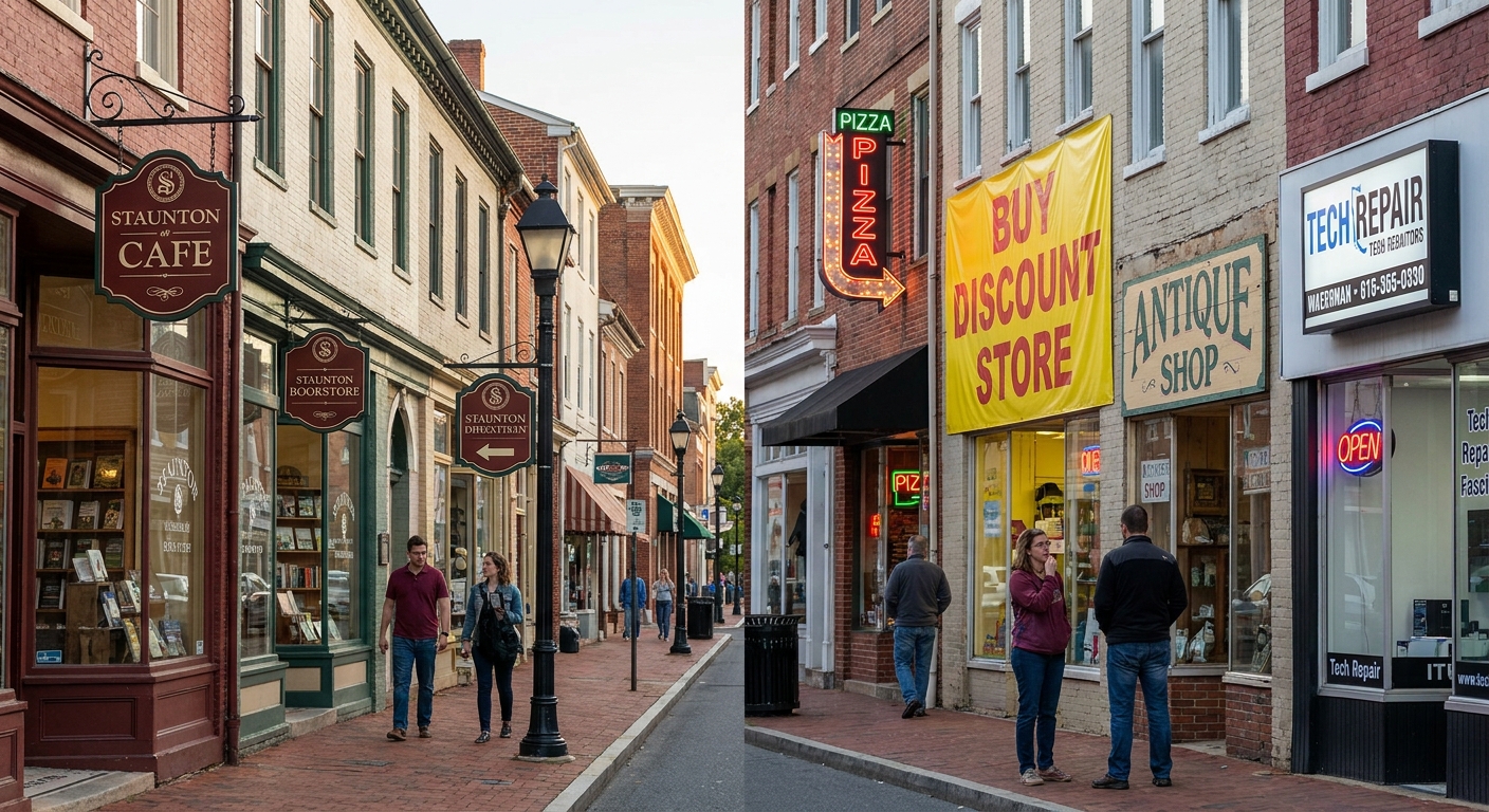
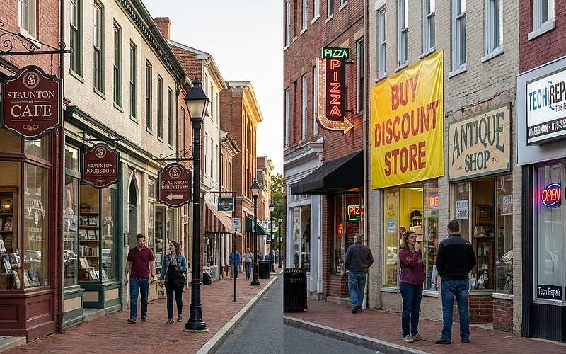
So here's the reality. If you're operating in Staunton and your signage looks disconnected from the rest of the block, you're not just hurting your own brand. You're fragmenting the entire streetscape. Every sign should reinforce the next. Every color, font, and layout decision should build toward something bigger than one storefront. And every piece of wayfinding should feel like it came from the same conversation—not a random grab bag of contractors.
Your Brand Lives or Dies on the Street
Recognition doesn't happen by accident. It's the result of repetition, clarity, and visual rhythm. When we maintain the same palette, typography, and graphic language across every touchpoint—from window decals to A-frames to directory boards—we're training people to spot us instantly. That's not vanity. That's survival in a crowded market.
In Staunton's downtown corridor, where foot traffic moves fast and attention spans are even faster, consistency becomes currency. If your signage shifts styles every ten feet, customers won't remember you. They won't trust you. And they definitely won't come back. But when the whole district speaks the same visual language, each business lifts the others. We all benefit from the cohesion.
- Unified color schemes make brands easier to recall
- Consistent fonts signal professionalism and stability
- Repeating graphic elements create subconscious familiarity
- Visual harmony across storefronts builds district-wide credibility
- Coordinated signage turns individual shops into a destination
Navigation Breaks Down When the Visuals Don't Match
People don't read signs—they scan them. And when every directional marker, parking placard, and event banner looks like it came from a different decade, scanning becomes guessing. That frustration adds up fast. Visitors get lost. Locals get annoyed. And the city starts to feel chaotic instead of charming.
Wayfinding only works when the system is predictable. That means identical icon styles, uniform sizing, and a shared grid that lets the eye move efficiently from point A to point B. Break that system, and you've broken the flow. We've seen it happen in cities that let every vendor do their own thing—the result is visual noise, not guidance.
- Standardized icons reduce cognitive load for first-time visitors
- Matching sign heights and placements improve scan speed
- Consistent arrow styles eliminate directional confusion
- Unified materials and finishes signal official versus unofficial information
- Repeating layout patterns help people predict where to look next
Safety Signs Can't Afford to Be Creative
Emergency exits, fire routes, ADA compliance markers—these aren't opportunities for artistic expression. They're life-or-death communication tools. And the only way they work is if they're instantly recognizable, even under stress. That requires absolute visual consistency, no exceptions.
We've audited properties where safety signage was treated like an afterthought. Different fonts. Mismatched colors. Inconsistent placement. The result wasn't just ugly—it was dangerous. When someone's looking for an exit in a smoke-filled room, they don't have time to decode a new design language. They need the same red, the same arrow, the same position they've seen a hundred times before.
- Universal color codes ensure instant recognition in emergencies
- Standardized symbols transcend language barriers
- Consistent placement trains muscle memory for fast exits
- Uniform materials guarantee visibility in low-light conditions
- Repeated testing of graphic clarity prevents misinterpretation
Tourism Depends on First Impressions That Make Sense
Staunton draws visitors year-round. History buffs. Arts enthusiasts. Weekend wanderers. And every single one of them forms an opinion within minutes of arrival. If the signage feels scattered or unprofessional, that opinion sours. But when the visual experience feels intentional—when the parking signs, attraction markers, and business directories all feel like they're part of the same system—confidence builds.
We've worked with tourism boards that underestimated the power of visual coherence. They spent thousands on ads and brochures, then let their on-the-ground signage fall apart. The disconnect cost them repeat visits. Because people remember how a place made them feel, and confusion doesn't feel good. Clean, consistent graphics say "we've got this under control." And that's exactly the message you want visitors to take home.
- Cohesive district branding makes cities Instagram-worthy
- Predictable wayfinding encourages exploration without anxiety
- Professional signage signals a city that values its guests
- Unified aesthetics turn casual visitors into repeat travelers
- Strong visual identity generates word-of-mouth and social shares
Standards Don't Kill Creativity—They Focus It
There's a myth that design guidelines strangle individuality. That's backward. Constraints breed better ideas because they force you to solve problems within a shared framework. When every business in Staunton works from the same foundational palette and typographic system, the creativity comes from how you apply it—not whether you ignore it.
We've seen districts thrive under strong visual standards. Local shops still express personality through layout, imagery, and messaging. But the underlying structure holds everything together. That's the difference between a curated experience and a free-for-all. One feels intentional. The other feels like no one's in charge.
- Shared design systems allow variation without visual clutter
- Established frameworks let businesses focus on message, not reinventing basics
- Consistent foundations make individual brands stand out more clearly
- Guidelines prevent costly design mistakes that hurt the whole district
- Creative freedom within structure produces better long-term results
Breaking the Pattern Breaks the Trust
Graphic consistency across Staunton's signage isn't a nice-to-have. It's the difference between a city that functions smoothly and one that fights itself at every corner. We build trust through repetition. We guide people through predictability. And we protect everyone—residents, businesses, visitors—by making sure the visual language is clear, consistent, and impossible to misread.
Every sign is a promise. A promise that this place knows what it's doing. That it respects your time, your safety, and your experience. When we honor that promise with graphic design, Staunton doesn't just look better. Professional banners and signs combined with expert vehicle wraps create a comprehensive visual system that extends from street level to mobile advertising. Strategic integration of emergency vehicle graphics reinforces public safety messaging while maintaining the same design standards that define the city's brand identity. If you're looking to establish visual consistency across your business presence, get a free estimate to discover how cohesive design translates into measurable results. And that's worth defending.
Let's Build Staunton's Visual Story Together
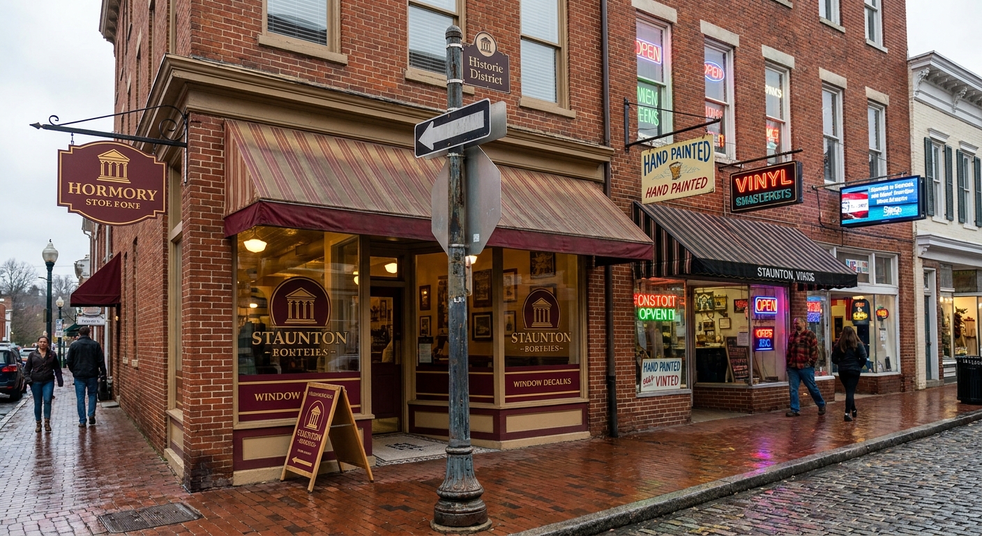
Consistency in signage is more than a design choice—it's how we shape Staunton's identity and make every visitor feel welcome. If you're ready to unify your brand and elevate your business with signage that truly connects, let's start the conversation. Call us at 540-607-0433 or get a free estimate and see how we can bring your vision to life, one sign at a time.
‹ Back
Recent Posts
-
Why Graphic Consistency Matters Across All Signage in Staunton
October 1, 2026
-
How to Choose the Right Banner Material for Harrisonburg Businesses
September 17, 2026
-
Best Ways Commercial Vehicle Wraps in Elkton Improve Local Advertising
September 3, 2026
-
What to Know Before Wrapping Your Business Fleet in Elkton
August 20, 2026
-