


By using our website, you agree to the use of cookies as described in our Cookie Policy
How to Design a Banner for Elkton Community Events
Elkton events live or die by visibility. A banner that pops gets people talking and showing up. One that blends in? Nobody cares. The difference comes down to clear words, bold color, and smart placement. Here’s what actually gets your event noticed.
Message That Gets Seen
Most banners fail before they’re even printed. Too many words, muddled colors, or fonts that blur at a distance. People drive by, glance up, and move on. The message never lands. To fix that, start with ruthless editing. Seven words or less. That’s the limit for anyone driving past at 30 miles an hour. Anything more gets lost.
- Stick to the essentials: event name, date, time, and location.
- Pick colors that punch through the noise. Think black on yellow, white on blue, or red on white. No pastels. No low-contrast blends.
- Choose a font that’s bold and simple. Script or thin lines disappear from fifty feet away. Block letters win every time.
- Drop in a local landmark or symbol. A silhouette of the Elkton bridge or skyline gives instant recognition. People know it’s local at a glance.
Hierarchy matters. The event name should dominate. Date and time come next. Location rounds it out. Everything else is clutter. Our professional graphic design team builds banners that follow these rules, so your message lands every time.
Size and Material That Hold Up
Banner size isn’t just about looking big. It’s about being seen from where it counts. For street banners in Elkton, four by eight feet is the minimum. Anything smaller gets swallowed by distance and traffic. Indoors, three by six feet works for most venues, but only if the space is tight and the crowd is close. The custom banner printing process lets you match the exact spot. No guessing, no wasted space.
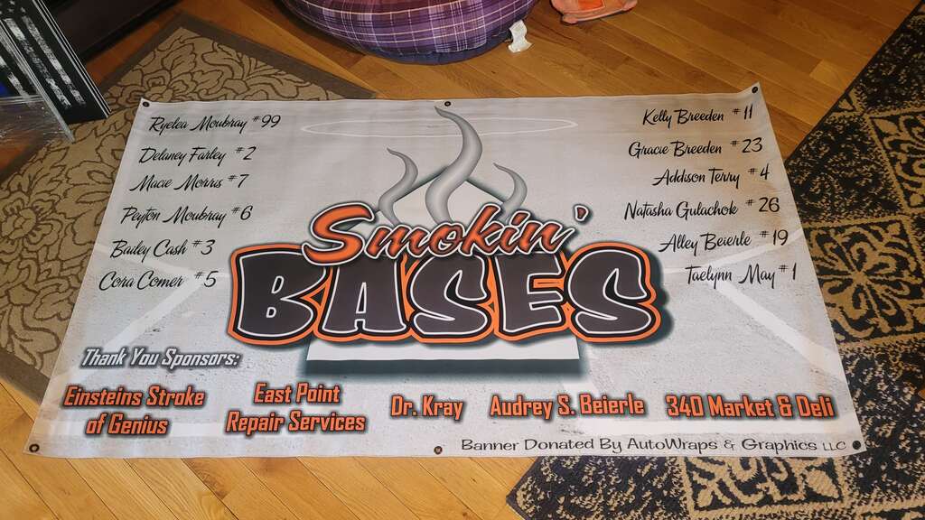
Material choice separates banners that last from those that sag or tear. Short-term indoor banners can use lightweight vinyl. It’s easy to hang and looks sharp for a day or two. Outdoor banners need more muscle. Heavy-duty vinyl with reinforced edges stands up to wind and rain. Wind slits keep the banner from turning into a sail. Grommets at every corner stop sagging and tearing. Our portfolio showcases real banners in Elkton. See what holds up and what doesn’t.
- Short event? Go light and save money.
- Outdoor or multi-day? Invest in heavy vinyl and strong mounting.
- Big crowd or high traffic? Go bigger than you think you need.
Nothing ruins an event’s first impression like a drooping, faded, or torn banner. Material and size are the foundation. Get them right, and the rest falls into place.
Placement That Delivers
Even the best banner fails if nobody sees it. Placement is everything. Hang it flat against a wall, and only people walking by will notice. Angle it toward the street, and you catch drivers, cyclists, and pedestrians. Perpendicular to traffic flow is the sweet spot. That’s where eyes land naturally.
- Check the sun’s path. Glare wipes out your message in the afternoon. Face banners away from direct sunlight when possible.
- Mount every corner. Loose edges flap and curl, making the sign unreadable.
- Use real hardware. Bungee cords, zip ties, or metal brackets work best. Tape and string fail fast.
- Test from every angle. Walk and drive past the spot. If you can’t read it, neither can anyone else.
- Sometimes, two or three smaller banners work better than one giant one. Cover more ground, reach more people.
Our team handles the full process, from site checks to final mounting. Proper installation keeps your custom graphics looking sharp from start to finish. We know how to position banners for maximum impact, so your event gets the attention it deserves.
Design Details That Matter
Every detail counts. Margins, spacing, and image quality can make or break the final look. Crowded text turns into a blur. Too much empty space wastes your canvas. The sweet spot is balance. Enough breathing room for each word, but no wasted real estate.
- Leave at least a two-inch margin on all sides. No text or logos near the edge.
- Use high-resolution images. Pixelation screams amateur.
- Keep logos simple. Overly detailed graphics get lost at a distance.
- Test your design at actual size. Print a section or use a projector. What looks good on a screen can flop at full scale.
Brand consistency matters, too. Use the same colors, fonts, and logo placement across all your event materials. People connect the dots faster when everything matches. Our graphic design team keeps your look tight and professional, no matter how many banners you need. At AutoWraps & Graphics LLC, we help Elkton organizers create a unified, memorable presence for every event.
Common Mistakes to Avoid
Plenty of banners miss the mark. The same mistakes show up again and again:
- Too much information. Nobody reads a paragraph at 30 mph.
- Low-contrast colors. Yellow on white, blue on green, or red on black disappear in daylight.
- Fancy fonts. Script, italics, or thin lines vanish from a distance.
- Weak mounting. Tape, string, or single-point hanging leads to sagging and tears.
- Ignoring the weather. Indoor materials outside won’t last a day in Elkton wind or rain.
Skip these traps, and your banner stands out. People see it, remember it, and show up.
Get Your Event Noticed in Elkton
AutoWraps & Graphics LLC delivers eye-catching banners that drive attendance at Elkton community events. Call us at 540-607-0433 or contact us to discuss your event signage needs.
‹ Back
Recent Posts
-
-
-
-
How Long Do Commercial Vehicle Wraps in Staunton Last?
June 11, 2026
-